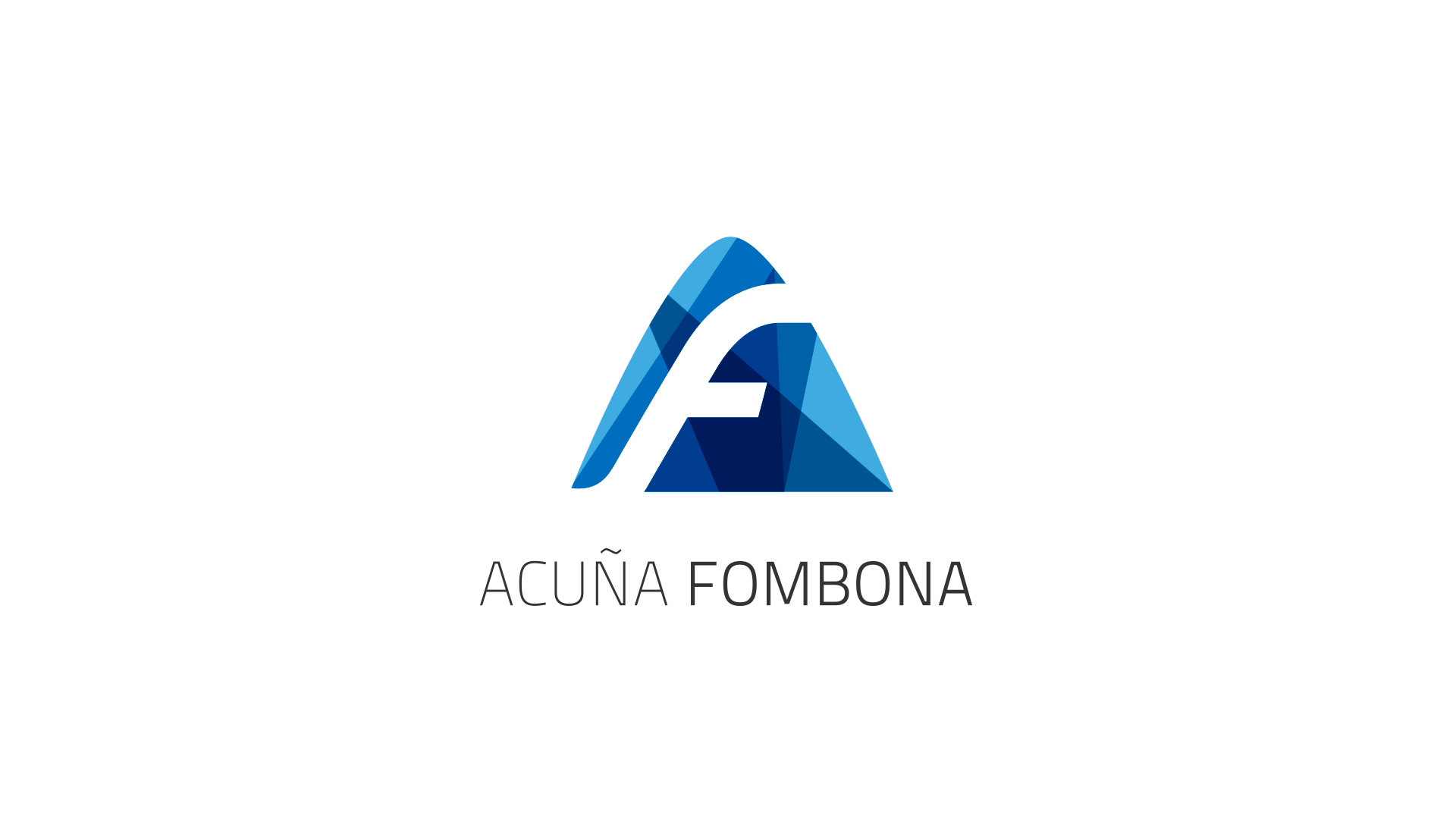
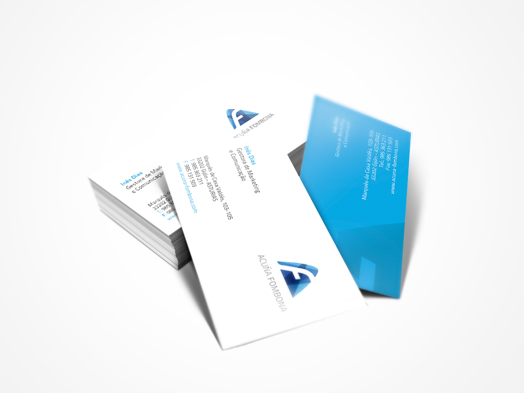
Acuña Fombona
Acuña Fombona believes that high quality surgical equipment can have a direct improvement in the success of medical interventions and in the quality of their patients lives. Their products are the most recent quality in the market. It was a brand with +40 years. The branding proposal broadened the color pallet, giving nuances to a visual dynamic and balanced group. The proposal extends the color palette, giving new nuances to a dynamic and balanced visual set. As part of the company's history, maintaining the triangle was very important. The triangle is a balanced form by nature and its superior vertex, subliminally, suggests the excellence in the pursuit of growth. It didn't make any sense to contain this energy and force within a circle.
Unfortunately the company decided not to use this design. The ideas I tested for Acuña Fombona symbol later were used for the TechITT brand at Gatewit.
Acuña Fombona
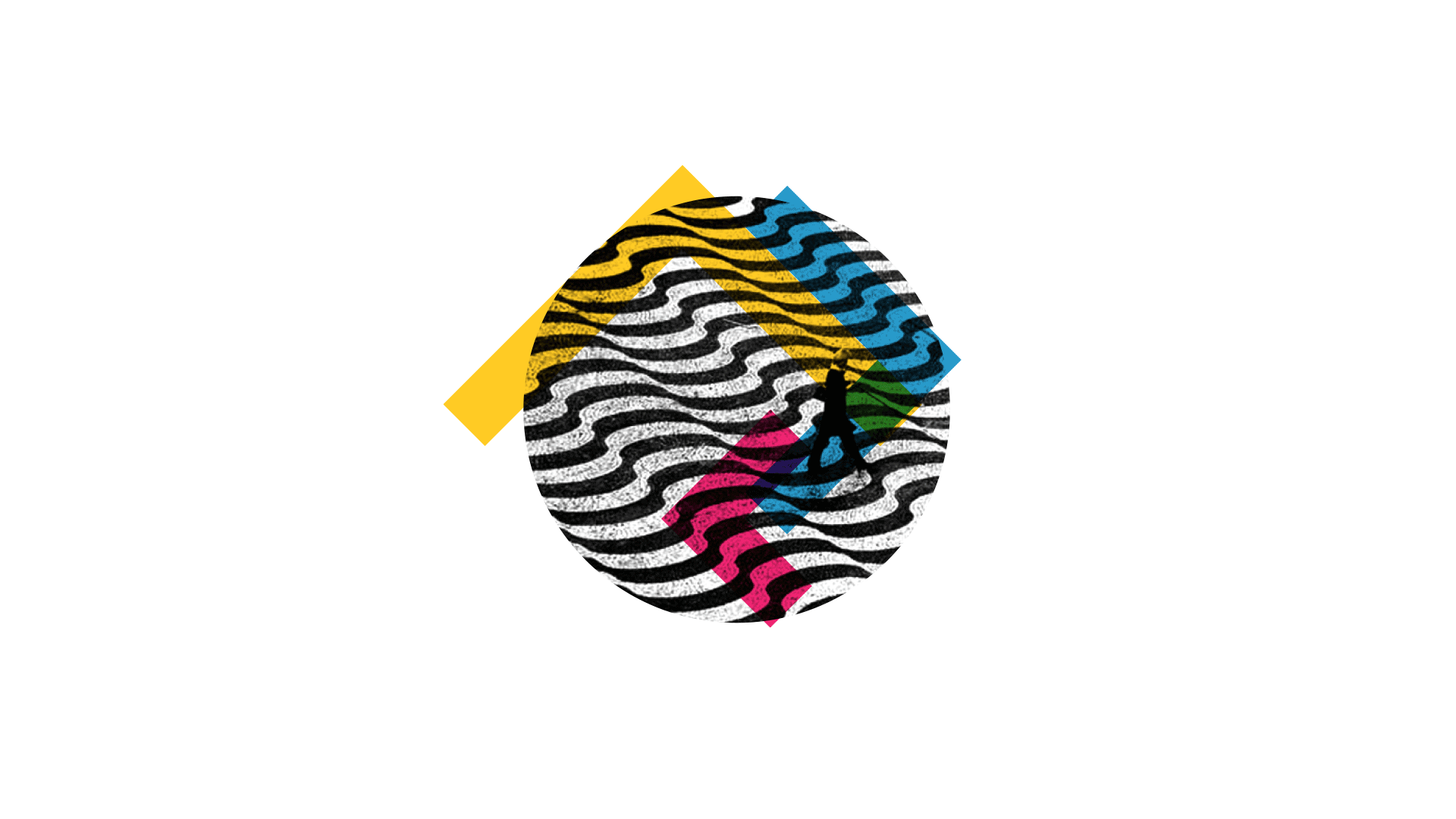
Acuña Fombona believes that high quality surgical equipment can have a direct improvement in the success of medical interventions and in the quality of their patients lives. Their products are the most recent quality in the market. It was a brand with +40 years. The branding proposal broadened the color pallet, giving nuances to a visual dynamic and balanced group. The proposal extends the color palette, giving new nuances to a dynamic and balanced visual set. As part of the company's history, maintaining the triangle was very important. The triangle is a balanced form by nature and its superior vertex, subliminally, suggests the excellence in the pursuit of growth. It didn't make any sense to contain this energy and force within a circle.
Unfortunately the company decided not to use this design. The ideas I tested for Acuña Fombona symbol later were used for the TechITT brand at Gatewit.
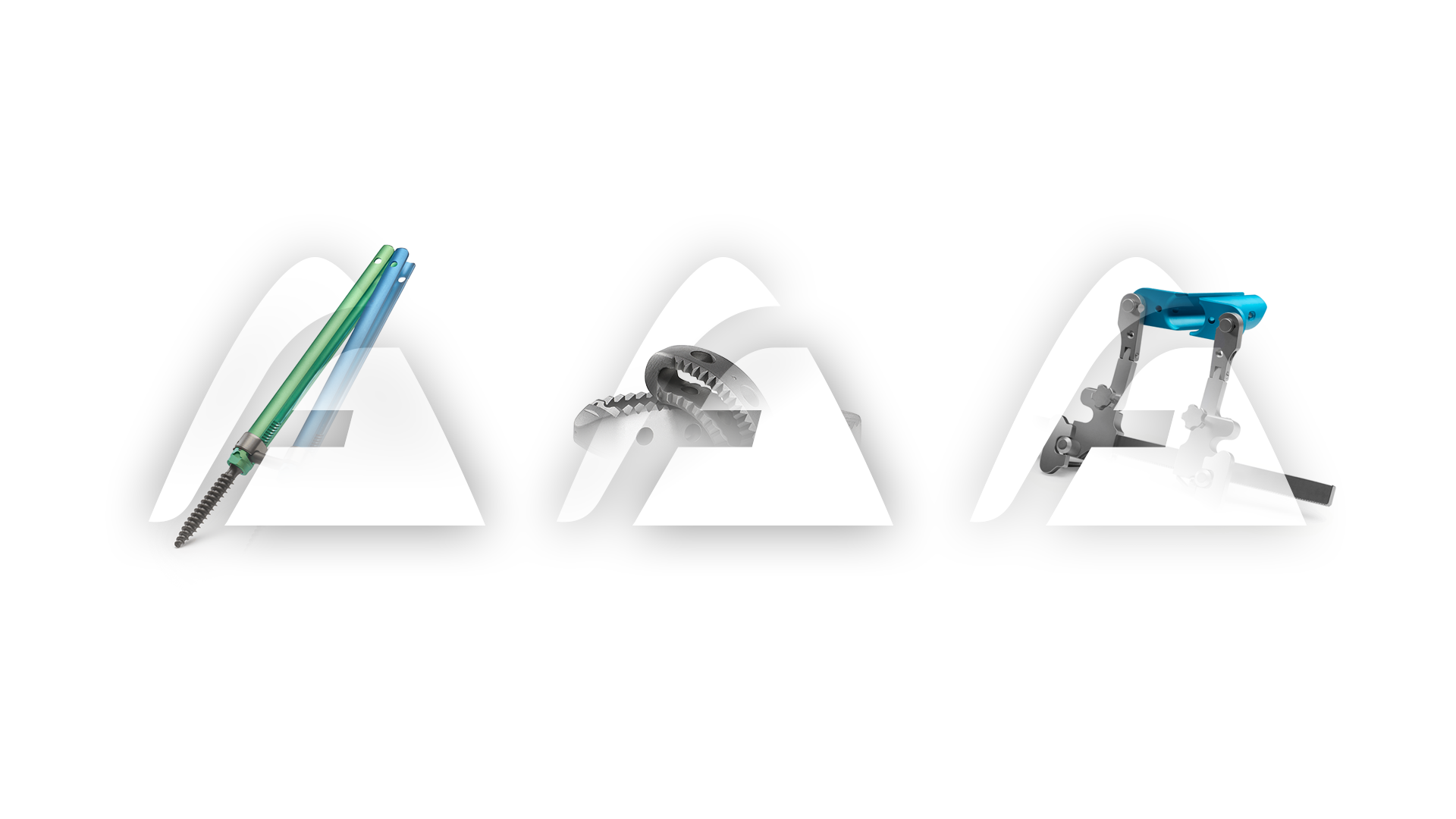
Acuña Fombona
Acuña Fombona believes that high quality surgical equipment can have a direct improvement in the success of medical interventions and in the quality of their patients lives. Their products are the most recent quality in the market. It was a brand with +40 years. The branding proposal broadened the color pallet, giving nuances to a visual dynamic and balanced group. The proposal extends the color palette, giving new nuances to a dynamic and balanced visual set. As part of the company's history, maintaining the triangle was very important. The triangle is a balanced form by nature and its superior vertex, subliminally, suggests the excellence in the pursuit of growth. It didn't make any sense to contain this energy and force within a circle.
Unfortunately the company decided not to use this design. The ideas I tested for Acuña Fombona symbol later were used for the TechITT brand at Gatewit.
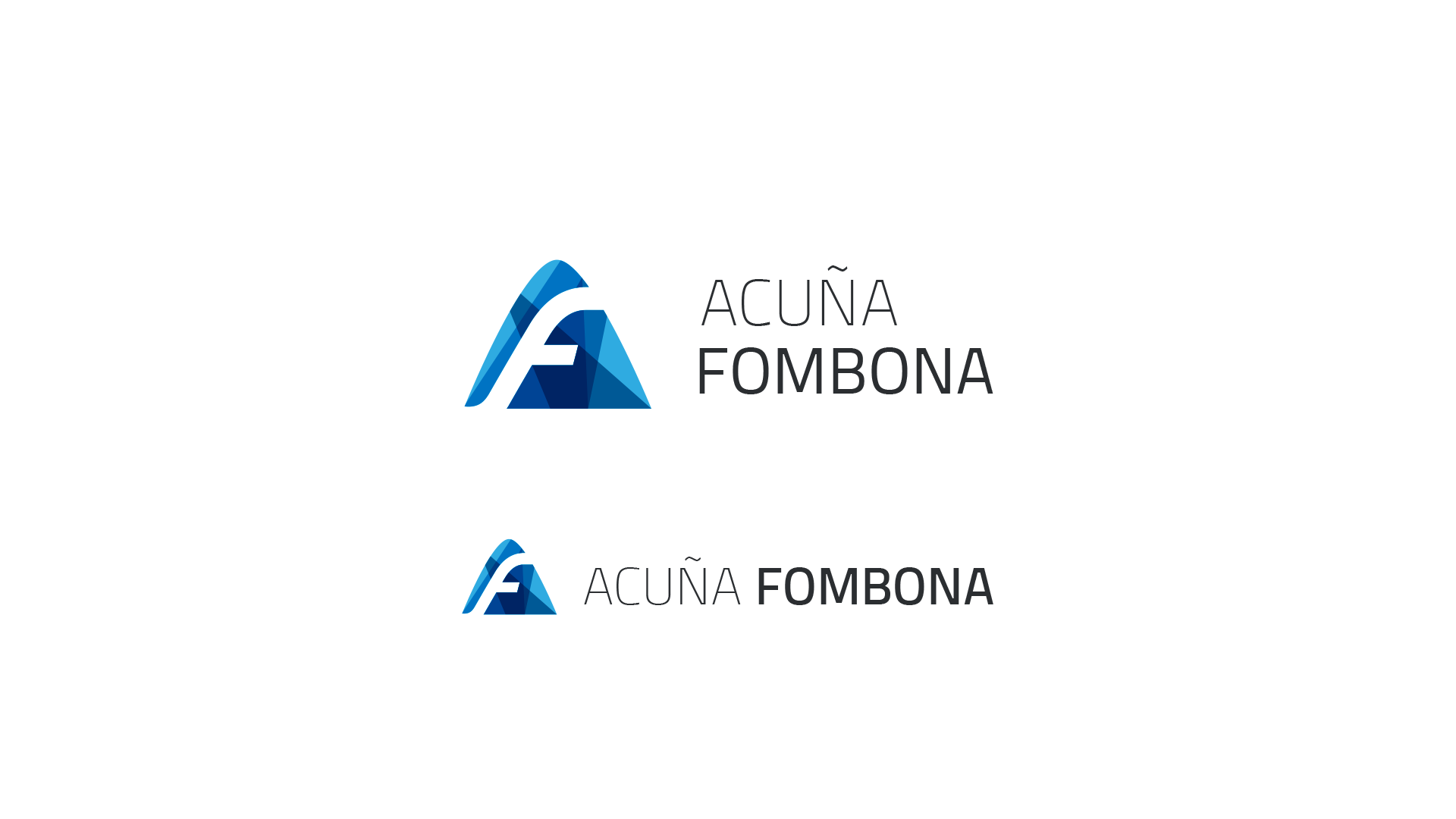
Acuña Fombona
Acuña Fombona has a brand with +40 years. The proposal extends the color palette, giving new nuances to a dynamic and balanced visual set.
Info:
Freelance
Unused
2014
Brand identity
Accademia di Belle Arti di Urbino
Typeface
Info:
Freelance
Unused
2014
Brand identity
Accademia di Belle Arti di Urbino
Typeface
Info:
Freelance
Unused
2014-2015
Brand identity
Accademia di Belle Arti di Urbino
Typeface
Info:
Freelance
Unused
2014 - 2015
Brand identity
Accademia di Belle Arti di Urbino
Typeface
Info:
Freelance, Unused, 2014 - 2015
Brand identity
Accademia di Belle Arti di Urbino
Typeface

Selected Works

Radar DigitalProject type

WinProject type
L3Project type

TechITTWeb Design
Acuna FombonaWeb Design

QarrotsUI/UX Design
© 2017 - Designed by Hernani Alves in Lisboa.